
application
A heatmap is a picture not a conclusion
How clustering, colour scale and row scaling change a gene-expression heatmap, and why the differential table and the contrast remain the result.
- Author
- EVRINTH Editorial Team
- Published
- 8 October 2026
- Updated
- 8 October 2026
- Reading time
- 8 min
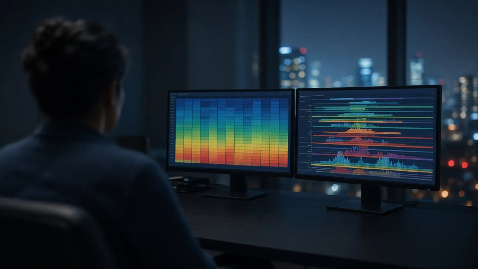
The eye finds blocks of colour. A heatmap is built to offer the eye blocks. Clustering reorders rows and columns so that similar things sit together, the colour scale decides what counts as extreme, and row scaling can make a timid gene look as loud as a violent one. None of that is the result of an expression study. The result is the contrast you specified and the table of estimates that came from it. This page is for anyone who has to defend a figure that started as a matrix. The study around the figure is from cells to a gene expression result.
Using the picture without handing it the conclusion
A heatmap is a legitimate way to show many genes across many samples at once. It earns its place in a paper when a reader can tell what the colours mean, what order the rows are in, and which statistical list, if any, supplied the genes. It overreaches when the caption says "the heatmap reveals" a mechanism the model never tested. Your decision, when you draw one, is whether this view answers a question the table already supports, or whether it is an exploration that must be labelled as exploration.
The numbers underneath should be traceable. A log-transformed count, a z-score, and a fold change against a calibrator are different matrices. qPCR fold changes and RNA-seq counts should not share a colour bar unless you have said how each was scaled. Gene identity should resolve on a browser such as Ensembl or the UCSC Genome Browser, so a symbol in the row label is the gene you think it is. Large public compendia, including the ENCODE project's encyclopedia of DNA elements in Science, show how expression is displayed at scale. They do not make your matrix self-explanatory.
What the colour is encoding
Pick a scale and write it on the legend in the unit you actually plotted. A diverging palette around zero suits a log fold change, where blue and red can mean down and up relative to a baseline you name. A sequential palette suits a non-negative abundance. Clipping the scale, so that everything above a cutoff becomes the same saturated colour, makes modest and huge effects look identical. Stretching the scale to the single wildest cell makes every other cell look pale. Both choices are display decisions. They should be deliberate, and they should not be the only place the magnitude exists.
Colour-blind-safe palettes and a legend that does not depend on hue alone are part of a figure a colleague can read. So is a statement of whether the matrix was centred. A missing legend is an incomplete method.
Clustering is a rearrangement, not a discovery procedure
Hierarchical clustering needs a distance and a linkage rule. Change either one and the dendrogram changes. The algorithm will find groups in noise if you ask it to return groups. The blocks you then see are partly the order it chose. That is helpful for spotting sample swaps and unwanted structure. It is a weak way to declare cell types, disease subtypes, or pathways, unless a separate analysis with a stated criterion supports the same split.
Column clustering is where batch effects go to look biological. Samples prepared on the same day resemble each other, the dendrogram glues them together, and a stripe of genes lights up under that glue. Put the preparation date, the operator and the kit lot under the columns, as urged in batch effects in an expression study. If the stripe matches the date, you have displayed a batch. If the columns stay in design order and the treatment groups still separate inside each date, the picture is doing harder work.
Row clustering groups genes with similar profiles. Those genes may share a regulator, or they may share a length, a GC content, or a sensitivity to degradation. The cluster is a hypothesis generator. The test of a named gene set is a different analysis, described in pathway lists and the multiple-testing problem.
Row scaling and the branch when picture and table disagree
Row scaling subtracts each gene's mean and divides by its spread across the samples in the figure. After that, every gene uses the full colour range. Patterns of shape become easy to see. Effect size becomes hard to see. A transcript that moves five percent and a transcript that moves fifty-fold can occupy the same red. If your claim is about magnitude, the unscaled log fold change, with a legend in that unit, is the picture that matches the claim. If your claim is about which samples share a profile, say that you scaled rows.
When a gene is brilliant on the heatmap and missing from the differential table, believe the inclusion rule of the table first. Check for an outlier sample, a clipped colour scale, and a multiple-testing threshold. Then decide whether the gene belongs in an exploratory panel. When a gene is in the table and invisible on the heatmap, the scale or the row scaling is hiding a real estimate. Fix the figure. Do not drop the gene from the result because the picture was quiet.
A useful branch is to draw two heatmaps from the same matrix: one with samples locked to the sample-sheet order and labelled by group and batch, and one clustered. If only the clustered version tells a story, the story may be the clustering. Show the locked version in the supplement so a reader can see the design.
| Display choice | What the eye then sees | What to report beside it |
|---|---|---|
| Samples in design order | Whether groups line up as planned | Batch and group labels under the columns |
| Clustered columns | Similarity, including unwanted batches | The distance and linkage, and a batch track |
| Row scaling | Shape, with every gene visually loud | The unscaled log fold change in the table |
| Clipped colour limits | Saturated blocks, compressed range | The limit values and the unclipped distribution |
| Genes from a significant list | The contrast you already tested | The FDR rule and the contrast definition |
| Genes chosen by eye from the picture | Whatever the scale emphasised | A label that this panel is exploratory |
Patterns the display can manufacture
An outlier sample with a failed library stretches the colour scale and paints the other samples as a flat field, or it forms its own cluster that looks like a subtype. Check library metrics before you name the cluster. A filter that keeps only the most variable genes guarantees a busy heatmap. Say the filter. Imputation of missing qPCR wells, if someone filled them with a group mean, manufactures agreement. Leave the well missing or show the imputation.
Combining RT-qPCR and RNA-seq on one heat map without a shared, declared scale invites a false visual consensus. A careful confirmation is a small table: the RNA-seq contrast, the qPCR fold change, the reference genes, and whether the direction agrees. That table is allowed to be dull. Dull agreement is a better result than a saturated picture.
Research figures are not diagnostic images
A heatmap in a research paper illustrates a stated analysis. It does not diagnose a donor, and it does not replace the ethics and biosafety framework that governed the samples. If the matrix includes human data, the display should follow the consent you actually have, including what identifiers sit under the columns. This page does not grant that consent.
A shipment stripe is still a batch
When samples arrive from another building or another city, the courier leg is a processing step. A clustered heatmap that groups every tube from one warm-season shipment is showing handling. Humidity, a delayed cold box, and a weekend in a receiving freezer can write that stripe. Label the shipment next to the preparation date. The differential table, built with that factor in mind, is where you ask whether any transcript effect survives it. The picture's job is to make the stripe obvious enough that nobody mistakes it for a subtype.
What to ask for when a figure is part of the work
If you request analysis or sequencing, say which contrast must be in the table, which gene filter is allowed, and whether heatmaps should lock sample order to the design. Those sentences keep the picture in its place. Catalogue classes for the sequencing side are in the genomics and sequencing catalogue. The sample path is the nucleic acid analysis pathway.
The mRNA sequencing enquiry reference and the differential expression analysis enquiry reference are enquiry references for discussing the measurement and the model. Put the contrast, the sample labels and the figure rules on the quote request, and ask whether a quotation is possible. A display can be discussed. The conclusion stays with the table you specified.
Questions from the bench
Does a tight block of colour on a heatmap prove a pathway?
It proves that, under the clustering and the colour scale you chose, those rows look similar. A pathway is a claim about a defined gene set and a stated contrast, and it needs the table and the test that belong to that claim. The block is a view. It can be produced by a batch, by row scaling, or by the order the algorithm picked.
What does row scaling change?
Scaling each gene to its own mean and spread gives every row a similar visual range. A gene that barely moves and a gene that changes many-fold can look equally dramatic. That is useful for seeing pattern shape, and it hides magnitude. Report magnitude from the differential table, where the log fold change is still in its original unit.
Should the columns stay in the order of the sample sheet?
Keep a version that respects the design, with groups and batches labelled, so you can see whether the biology or the processing date lines up. A clustered column order is a second view. It is fair when you say it was clustered, and it is misleading when it is presented as if the samples had been arranged by the experimental plan.
A gene looks hot on the heatmap and is absent from the significant table. Which do I trust?
Trust the contrast you defined and the error rate you set, then use the heatmap as a picture of that list or of a declared exploratory set. A bright cell can be one outlier, a colour-scale clip, or a gene that failed the multiple-testing bar. The table is where inclusion rules are visible.
References
Manufacturer names identify published method classes. Trademarks remain with their owners. Catalogue records on this site are independent references for enquiry. They are not a statement of inventory, distribution rights or a supply commitment. This page is educational. It is not medical advice, a diagnostic protocol or a biosafety approval.
Catalogue
Related products and categories
These links follow the subject of the article into published manufacturer references. A listing is a reference for an enquiry, not a statement of stock or distribution rights.
Continue in this cluster
Related reading
From cells to a gene expression resultHow a laboratory goes from cells to a gene expression result, and how RNA quality decides between a focused RT-qPCR assay and RNA-seq.Pathway lists and the multiple-testing problemHow testing thousands of genes creates a multiple-testing problem, and why a pathway table built on an already chosen list is not yet a mechanism.Batch effects in an expression studyWhat a batch effect is in an expression study, how library date, operator, sequencer or kit lot can dominate a PCA, and what a correction model can adjust.